The Overstory
“The Overstory” is a politically charged novel that explores the profound significance of trees in our daily lives and their enduring impact across generations. As the narrative unfolds, these individuals and their stories gradually connect to form a powerful representation of humanity’s place within the natural world. Additionally, it sheds light on the inherent dangers and legal complexities faced by environmental activists.
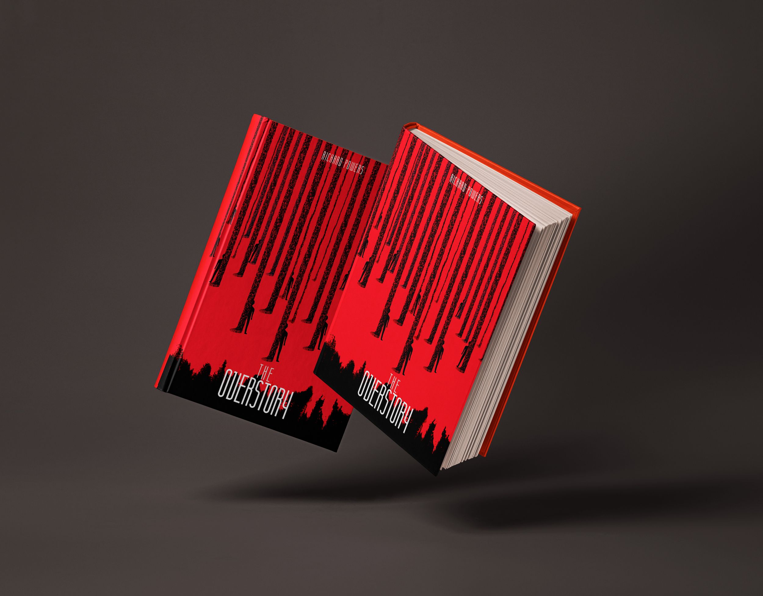
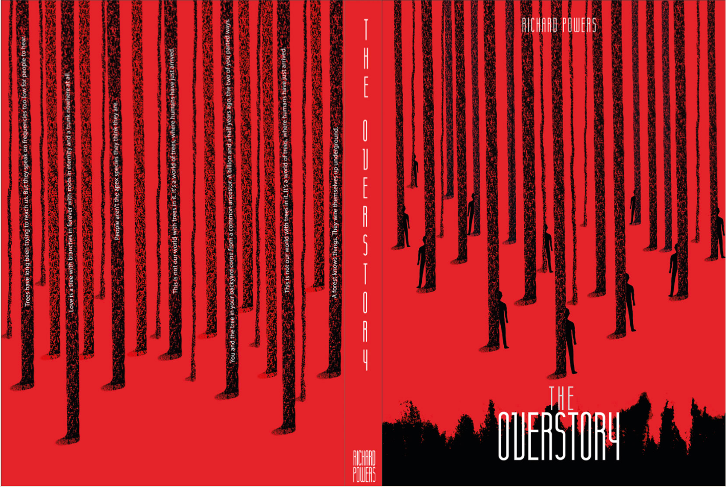
The book cover attempts to capture the essence of individuals profoundly influenced by trees, coming together to fight for nature and resilience against adversity. Through its design and color choices, it conveys the urgency of its defense, evoking a sense of both awe and responsibility in the reader.
My process:
Red and black contrast
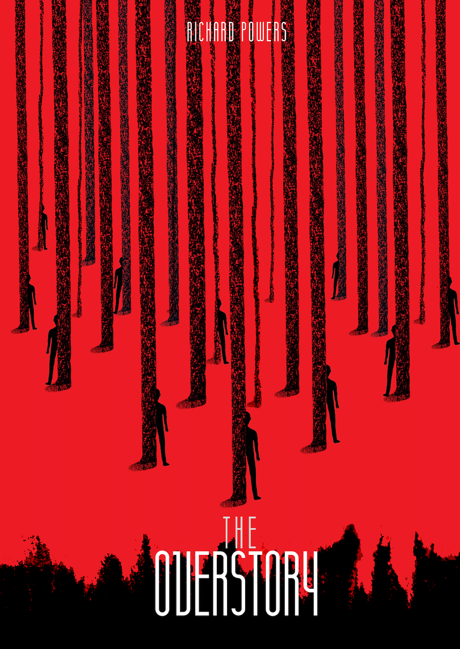
The bold red-and-black palette immediately sets an emotional tone. It’s raw, urgent, and intense. The red evokes both vitality and destruction, while the black injects mystery and foreboding. Together, they mirror the book’s tension between human aggression and nature’s quiet resilience.
Chalk-textured trees
The trees were illustrated with a rough, chalk-like texture to symbolise imperfection and fragility. This stylistic choice reflects how the natural world, though seemingly strong, is constantly marked by human touch. The hand-drawn feel adds authenticity, grounding the story in something tactile and organic.
HUMAN FIGURES IN THE FOREST
Scattered silhouettes among the trunks hint at humanity’s smallness within the vast ecosystem. Their stillness contrasts the towering forest, reinforcing the idea that humans are part of nature’s story, not the other way around.