LL Housekeepers
LL Housekeepers is a Brisbane-based cleaning company that stands out for its commitment to quality, reliability, and transparency. Specialising in commercial and Airbnb cleaning, the company focuses on delivering a seamless and professional experience for every client.
Their branding called for a minimalistic yet refined visual language — one that communicates order, precision, and a sense of calm. I designed a logo that reflects these values: clean lines, balanced composition, and a modern aesthetic that evokes both freshness and trust.
The goal was to create an identity that feels unmistakably tied to the concept of cleanliness, while also appealing to an upscale clientele. It needed to look polished but approachable, the kind of brand that feels dependable at first glance.
Ultimately, the logo and website work together to express LL Housekeepers’ promise: a trustworthy, professional service that takes pride in making every space feel effortlessly spotless.
MY PROCESS:
MINIMALIST AND PROFESSIONAL LOOK
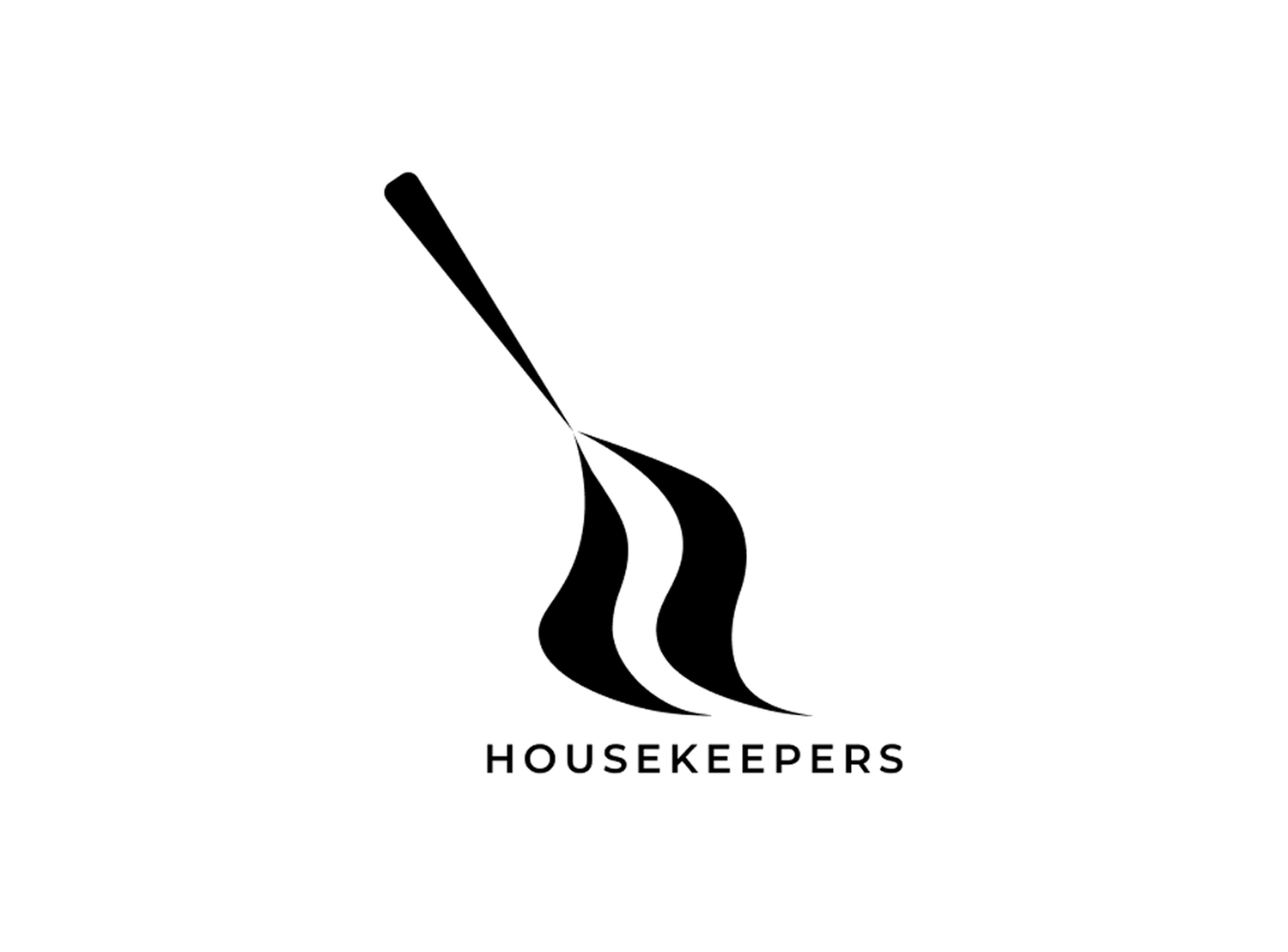
The logo uses clean, flowing lines and a monochrome palette, reinforcing a refined and professional feel. The absence of unnecessary details ensures it remains visually uncluttered, much like the pristine spaces LL Housekeepers aims to create.
ABSTRACT BROOM SILHOUETTE
At first glance, the logo resembles a broom, an unmistakable symbol of cleanliness and order. Subtly, these curves also form two flowing L’s, a clever visual nod to the brand name, LL Housekeepers.
MODERN TYPOGRAPHY
The choice of a modern, sans-serif font for "HOUSEKEEPERS" enhances readability and professionalism. Its balanced, straightforward look aligns with the company’s values of transparency and reliability.