GenZ.AU
GenZ.Au was founded with a mission to assist teenagers navigate the balance between academic commitments and physical well-being. Its approach involves employing teenage coaches who understand the challenges of balancing both studying and exercising, faced by their peers. This initiative not only promotes mental and physical fitness but also fosters a safe, inclusive space where teenagers can support and motivate each other.
The GenZ.Au logo is a carefully crafted visual representation of this mission. Its overall shape resembles a mountain, symbolising the journey of growth, perseverance, and eventual success. Bold, Minimalist Aesthetic – The clean, structured lines give the logo a modern and dynamic feel, appealing to a younger demographic. Its monochromatic design ensures versatility across digital and physical branding while maintaining a strong visual impact.
PARTS OF THE LOGO:
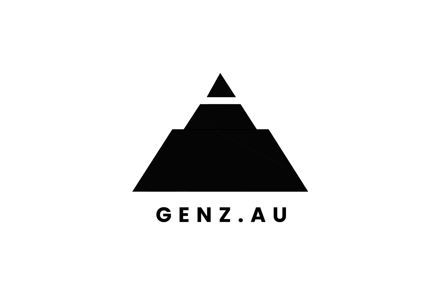
BOTTOM SECTION (DUMB BELL)
The base of the logo, shaped like a dumbbell, represents the strong drive within this generation to stay healthy and fit. It symbolises a commitment to self-improvement, not just academically, but physically and mentally as well.
ASCENDING LAYERS (PROGRESS)
These layered sections illustrate growth, momentum, and upward movement. They reflect the continuous effort of Generation Z to evolve, improve, and push forward in all areas of life.
PEAK (PENCIL POINT)
The sharp point at the top is a deliberate nod to academia, resembling the tip of a pencil. This element highlights the equal emphasis placed on education, encouraging intellectual growth alongside physical fitness.